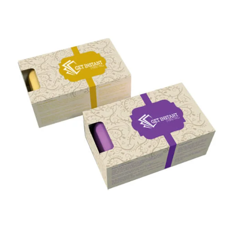
Color is the first thing shoppers notice about a soap box. Before they read your name or feel the texture, their brain makes a snap judgment based on color. That judgment can suggest purity, luxury, energy, or care—often in a split second. When you understand the psychology of colors in soap box packaging design, you can guide those reactions on purpose. The result? Stronger branding, higher recognition, and more confident purchases both on the shelf and in an online thumbnail.
Why Color Matters on a Soap Box
Color works at two levels. It creates emotion, and it communicates meaning. A soft pastel can whisper “gentle” and “safe.” A rich black can signal “premium” and “sleek.” On crowded retail shelves, color blocks help your box stand out from the category herd. Online, the right hues make small images pop and stay legible on different screens. Color also supports brand memory. When your palette is consistent across your soap boxes, inserts, and website, customers find you faster and trust you more.
What Different Colors Communicate
- White: Clean, simple, pure. Great for fragrance-free, baby, or dermatology-forward soaps.
- Green: Natural, organic, eco-conscious. Deeper greens feel grounded; brighter greens feel fresh and energizing.
- Blue: Trust, calm, clarity. Lighter blues suggest softness; navy reads as professional and refined.
- Black: Luxury, minimalism, sophistication. Use with restraint and strong contrast for legibility.
- Purple: Indulgence, creativity, spa-like self-care. Lighter lavenders feel gentle and soothing.
- Pink: Tender, uplifting, modern. From blush (calm) to hot pink (bold and playful).
- Yellow: Optimism and warmth. Works well for citrus or summer scents; ensure dark text for readability.
- Orange: Friendly, energetic, extroverted. Ideal for exfoliating or invigorating bars.
- Red: Powerful, passionate, attention-grabbing. Use sparingly in bath and body to avoid “harsh” cues.
- Neutrals/Earth tones: Authentic, artisanal, sustainable. Perfect with kraft paper to emphasize natural ingredients.
Use color combinations to layer meaning—for example, white + green for “pure and natural,” or black + metallic foil for “premium gifting.”
Culture, Context, and Category Cues
Color meanings shift by culture. White signals purity in many Western contexts, but it can be associated with mourning in parts of East Asia. Red symbolizes luck and celebration in China. Research where your customers live, and test locally if possible. Also consider category norms. Many “natural” soaps lean into greens and kraft; “spa” lines use white, soft blues, and lavender. You don’t have to copy the category, but you should know the rules before you break them. Strategic contrast can help you stand out without confusing buyers.
Materials, Finish, and Contrast
Ink behaves differently on coated versus uncoated stocks. A mint green that looks bright on glossy white may appear muted on kraft. Matte finishes feel modern and soft; gloss amplifies vibrancy and can look “wet,” which suits fresh, clean concepts. Soft-touch lamination adds a velvety feel that pairs well with calming palettes. Metallic foils and spot UV add sparkle and premium cues—but make sure they support, not overpower, your core colors. Above all, protect readability: use high contrast for product names, ingredients, and claims. Test for color-blind accessibility with tools or grayscale previews.
Build Your Palette
Start with roles. Choose one dominant color to set the emotional tone, a secondary to support it, and an accent for calls to action or key claims (the 60-30-10 rule is a reliable guide). Align your palette with your brand promise: are you gentle and dermatology-backed, earthy and handmade, or indulgent and giftable? Select hues that match the fragrance story, too—citrus loves yellow and orange; lavender sings with pale purple; charcoal bars pair beautifully with black, slate, and silver. Keep the system flexible so different SKUs share a core base while each scent gets a clear color cue.
Test and Improve
Screens lie. Colors that glow in RGB shift in CMYK. Always request printed proofs and, if possible, Pantone guidance for critical hues. View samples under multiple lights—daylight, warm retail bulbs, and office fluorescents. Do a “shelf test”: place your mockup among competitor boxes to see if it stands out and reads quickly from six feet away. Then try an “at-home test”: does it look good on a bathroom counter? Ask real customers which versions they prefer and why. Small adjustments in saturation or contrast can lift sales.
Avoid These Mistakes
- Using too many colors and losing focus.
- Low contrast between text and background, especially on matte or kraft.
- Ignoring cultural nuances for international customers.
- Chasing trends that clash with your brand’s core identity.
- Overusing neon tones that print poorly or fatigue the eye.
- Forgetting sustainability cues when your product story is eco-led; color and material should align.
Clarity beats complexity. If buyers cannot read it or place it fast, they won’t pick it up.
Work With a Trusted Printer
Great color needs great production. A partner like Boxprintingforless can help you navigate paper choices, finishes, and color management so your soap box packaging design prints the way you intended. Ask about Pantone matching, eco-friendly inks, and recycled or kraft stocks that keep greens and earth tones looking rich. Request dielines early to plan color breaks and foil areas. Whether you need short runs for testing or larger volumes for retail, a skilled printer streamlines proofing and helps you avoid costly reprints.
Conclusion
Color is a powerful shortcut to emotion, meaning, and memory. When you choose hues deliberately—and pair them with the right materials, finishes, and contrasts—your soap box becomes a silent salesperson. Start with the feeling you want to create, build a focused palette, test in the real world, and refine. With thoughtful design and the right printing partner, your packaging won’t just look beautiful; it will move people to choose your brand again and again.